Sunday, February 27, 2011

Rich Pellegrino's Character style


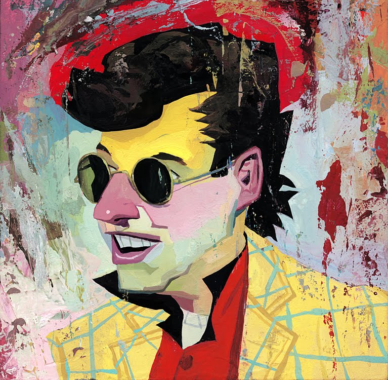
I found an illustrator(Rich Pellegrino) who works with portrait. I thought this is an interesting style to share. He uses solid colors(gouache) yet the characteristics are successfully depicted. Hope this could be an inspiration for character style

Tuesday, February 22, 2011

Composition: Iggy Peck Architect illustrated by David Roberts


I really love David Robert's use of composition.  There are many other great examples of good composition in this book.  He makes great use of the subject matter, architecture, in the layout of each page.  I chose these two spreads to show how he uses composition to create Iggy's world where architecture is everywhere.

Character: Spork illustrated by Isabelle Arsenault

This is a really sweet book about a spork who feels like he doesn't belong.  I really love this book's character design.  It is so charming with its use of limited color, collage and other mixed media.  It gives the book a quirky feel, and each fork, spoon, etc. seems entirely unique.

Type: Salvatore Rubbino's A Walk in New York

This book is full of fun examples of hand lettering.  I also think the type itself is placed nicely on the page.  Rubbino does a good job with differentiating between what type is part of the narrative and which type is meant to be simply informative.

Monday, February 21, 2011

Color, Lisbeth Zwerger, The Wizard of Oz


I greatly enjoy Zwerger's sense of color. She is conservative, not very bold, yet she adds a touch of saturation every so often which has an incredible impact.

Composition, Lisbeth Zwerger, Alice in Wonderland


Lisbeth Zwerger has an amazing sense of shape and composition. She works with bold shapes and delicate details to make a dynamic composition.

Character, Elena Odriozola, Marte y Las Princesas Voladoras


Elena Odriozola's bold shapes and delicate patterns make up really unique and interesting characters. I can't get enough.

Saturday, February 19, 2011

Character/Color, Denise Fleming, Buster

The colors are very vibrant. Also, think the characterization of the dog and the cat is really great. Especially like the cat's quirky expression as it changes the channel on Buster's radio...

Composition, Don Wood, The Napping House


Love the perspective in this page spread.

Color, Don Wood, The Napping House


Mind blowing colors! This book, for the most part, consists of many blues, purples, and other cool colors. Then it suddenly takes a turn, and completely surprises the viewer with these second to last two pages. Love how the yellow just screams on the page, it's crazy!

Character, David Shannon, No, David!

This illustration gives viewers a great idea of what kind of troublemaker David is like.

Type, Steve Johnson and Lou Fancher, My Many Colored Days


Two examples of plays on type from "My Many Colored Days."

In the first spread, I like how some words are written (and even placed) in a way where they mimic what they mean (ex. "I walk alone" is super small, and isolated on a page... mimics the action of sadly walking alone)

In the second spread, I like how the type interacts with the illustration and implies how it should be read.

Character, David Catrow, Stand Tall Molly Lou Melon

I think this illustration gives a great impression of what the main character, Molly Lou Melon, is like. Plus, the frog's expression is priceless.

I just simply can't get over how great the characterization of the cat is. The grandma's pretty cool, too, but whenever I look at this illustration, I can't help but wonder about the cat!


Composition, David Catrow, Stand Tall Molly Lou Melon

Really exciting composition! Love the pose of both the characters, and all of the splatter-like details in the background.

Color, Jon J. Muth, The Three Questions

Another image from Jon J. Muth's The Three Questions... I thought it was a really great spot... I especially like how the steam of the coffee was painted. The muted colors help set the mood, and the decision to have the green coffee cup complement the boy's red shirt was a good idea!

Color, Jon J. Muth, The Three Questions


I really like how the cool colors in this painting create an almost otherworldly atmosphere. Also, I like the artist's choice to use warm colors for the boy.

Character/Composition. Jim Field. Cat's Ahoy


I like both the character and composition aspects that this piece convey. The character is very endearing, a little cute orange tabby who is (or playing) pirate with his pirate hat with a cat skull on it and his little outfit. The composition has him off to the side but elevated in a dramatic pose. It shows the hull of the ship with a cute little added feature of a fish head as the head piece. I like the stars background giving a hint of the vastness of his travels. The mast and the fish head are both elements that lead your eye somewhat off the page, but more I feel they lead you outward as in the direction the ship is going. I think you are ultimately not taken off because you are leaded back by the arrangement of stars and the opposite direction up and to the left by the cat's sword raised high.

Wednesday, February 16, 2011

Character. Eugene Yelchin. Red Riding Hood and Wolf Illustration


I found this illustration purely by accident just looking around on the internet for children book illustration artists and images. I found this a vary unique way of interpreting the wolf in the classic tale of Little Red Riding Hood. His head being bigger than his body is both hilarious and menacing. It also is a good metaphor for an inflated ego. I love the suit, it makes me think of a sleazy used car salesmen. His posture of a "devil may care" attitude on the bench fits with the type of character Mr. Yelchin is presenting to us. It is adding human traits to the wolf, thus I think, making him more devious and cunning.

Monday, February 14, 2011

Cool underwater colors, Ryan Mauskopf, Triton and the Fishing Net


Its a fun composition, character expression, and underwater scene by Ryan Mauskopf

Character of A Lion. Amy June Bates. Christian, The Hugging Lion

In the book, Christian, The Hugging Lion, Amy June Bates has used her unique style to portray a real life character. Her style is unlike any I have currently seen. At first glance her illustration of Christian the Lion appears to be done all in watercolor. She allows pencil marks to show through as a texture. On very close observation you can see colored pencil(on the lions check and the outline of his body and arm. She uses the white as fur and light, varying on the amount of blend. The lion is composed very much to a real life representation, but Amy is adding a certain charm and playfulness of personality, displayed mostly through the eyes and facial expressions of the characters in the book(especially Christian).

Monday, February 7, 2011

Tuesday, February 1, 2011